Elements
Last updated 24. June 2024
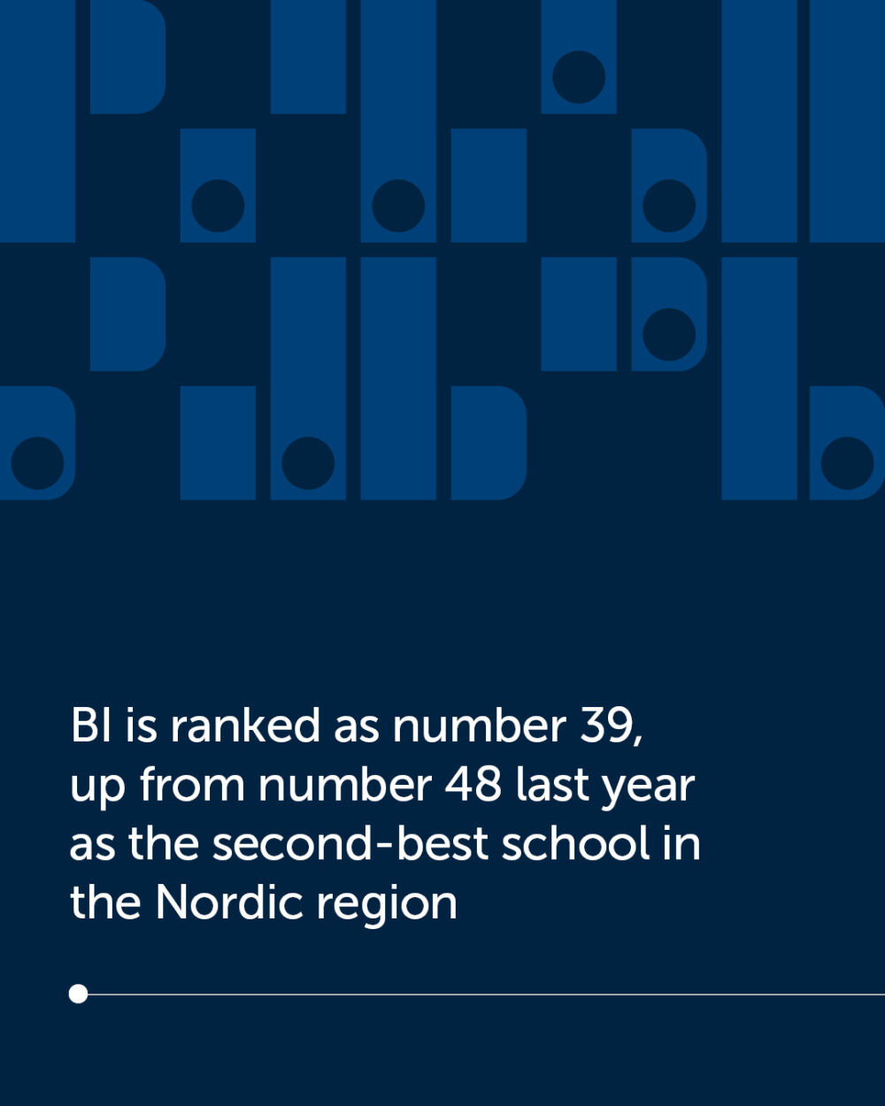
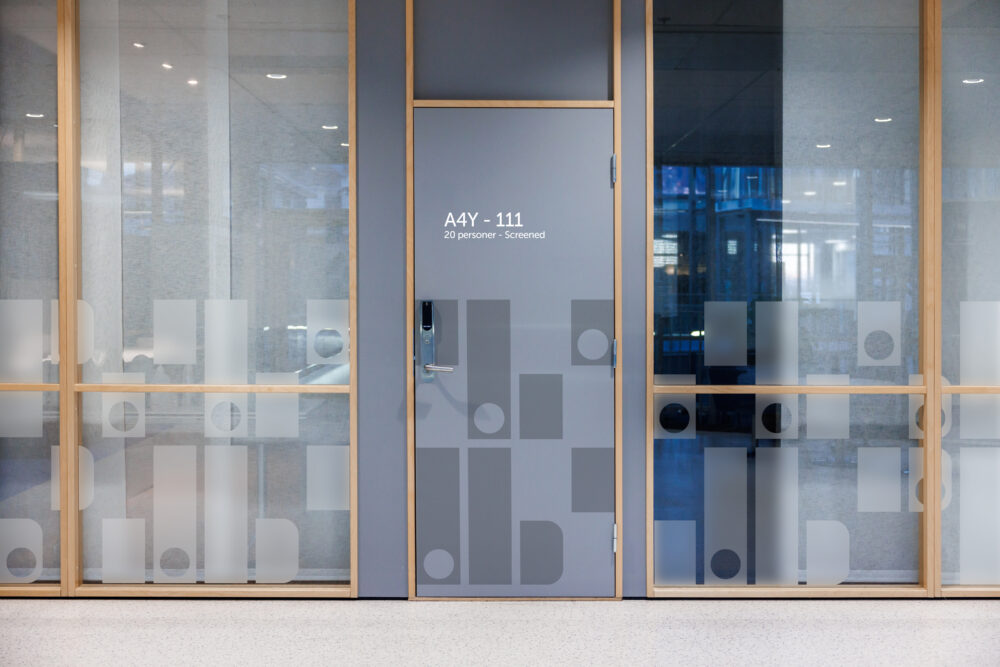
The design elements focus on the connection between humanistic, round, open and gentle shapes, and its contrast to the more rigid and solid blocks and sharp edges conveying the business and industry.
The visual concept
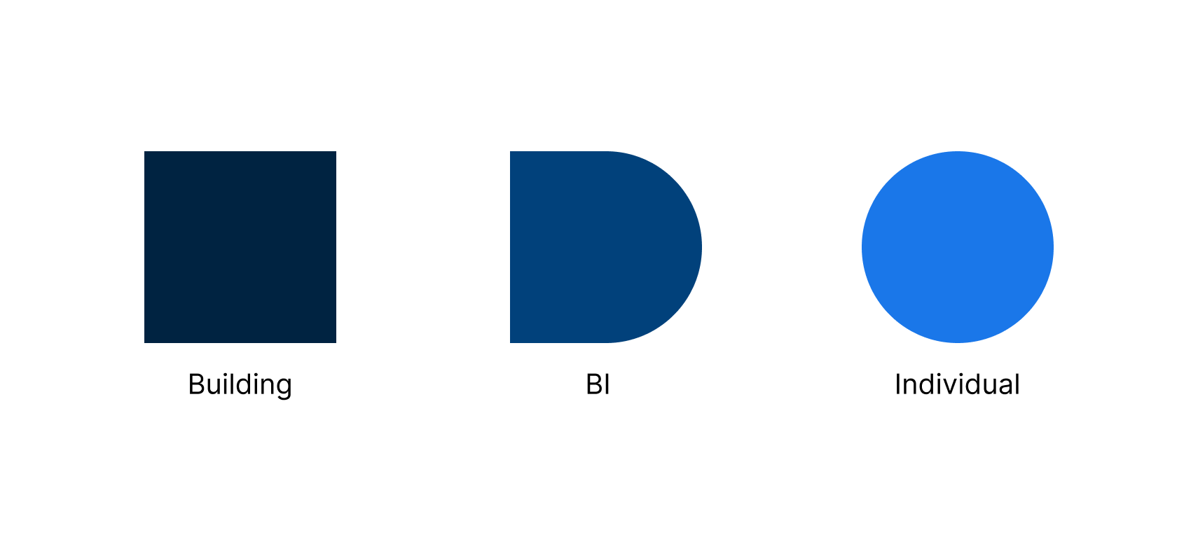
BI’s design concept is based around the “Building (the school)” and the “Individual (student, staff, alumni)”.
The building is a rectangle and individual is a circle, and together they are “BI” (a square with right side rounded corners)
Historical form language
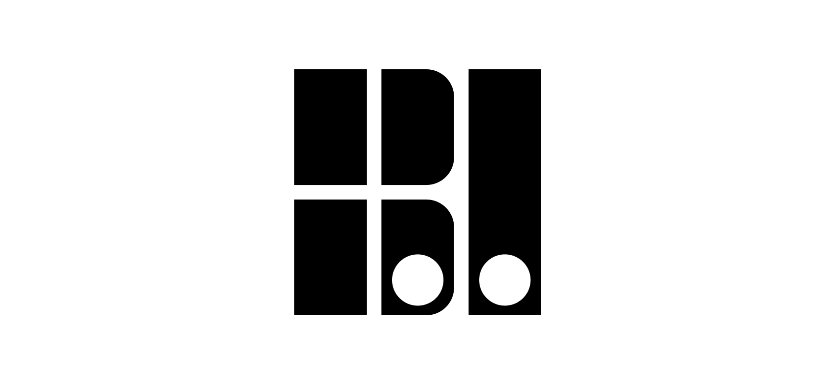
BI’s design concept is based on the schools old logo made in the 70s.
The logo is a stylized factory window spelling “BI”, telling the viewer it's a business school.
Shaped and combinations
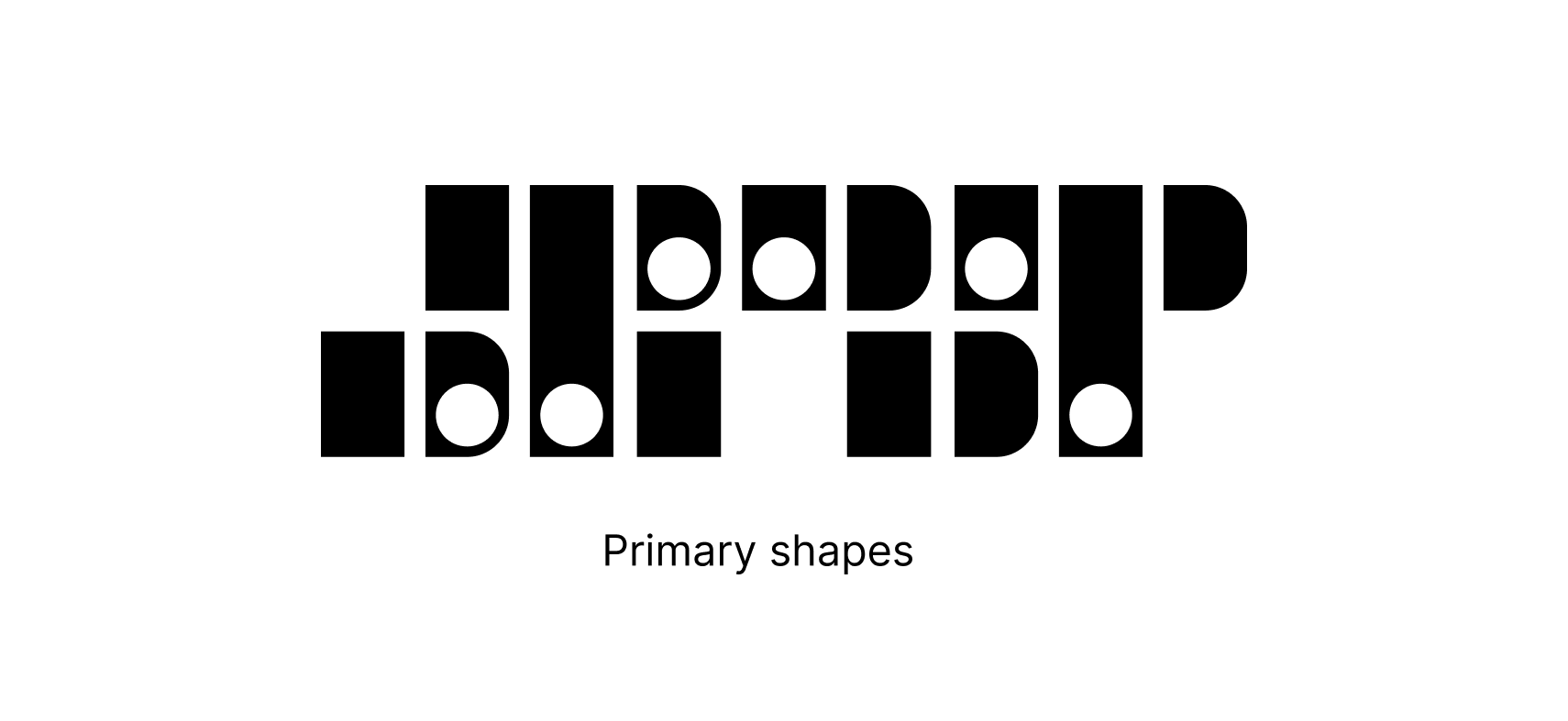
The old logos unique shapes and composition are used as the building blocks for BI’s new design concept. It has been modernized and made multiapplicable as patterns, frames etc.
The shapes represent the way individuals change BI and BI changes them, while keeping the visual language and symbolism in BI’s old logo.
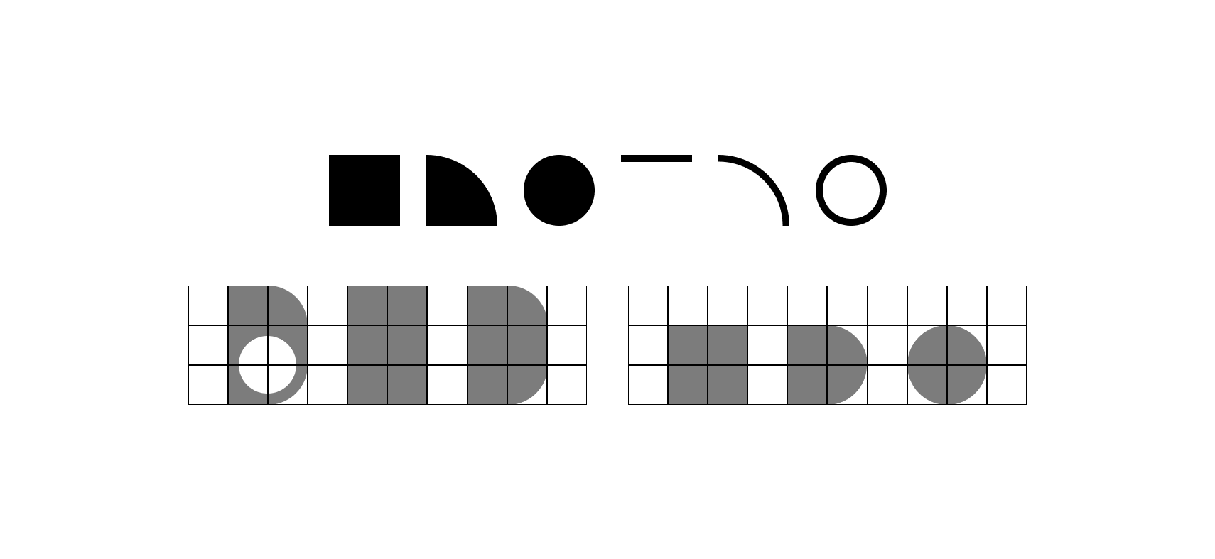
Primitives and grid
The BI shapes are made using primitives and a square grid.
This makes it easy to build from scratch, and keep sizes and visual language consistent.
Secondary shapes can be based on the primary, and used as buttons, bulletpoints etc.
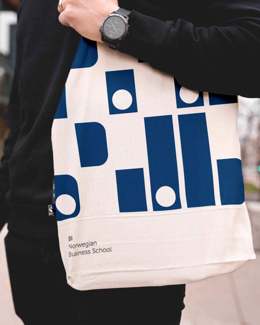
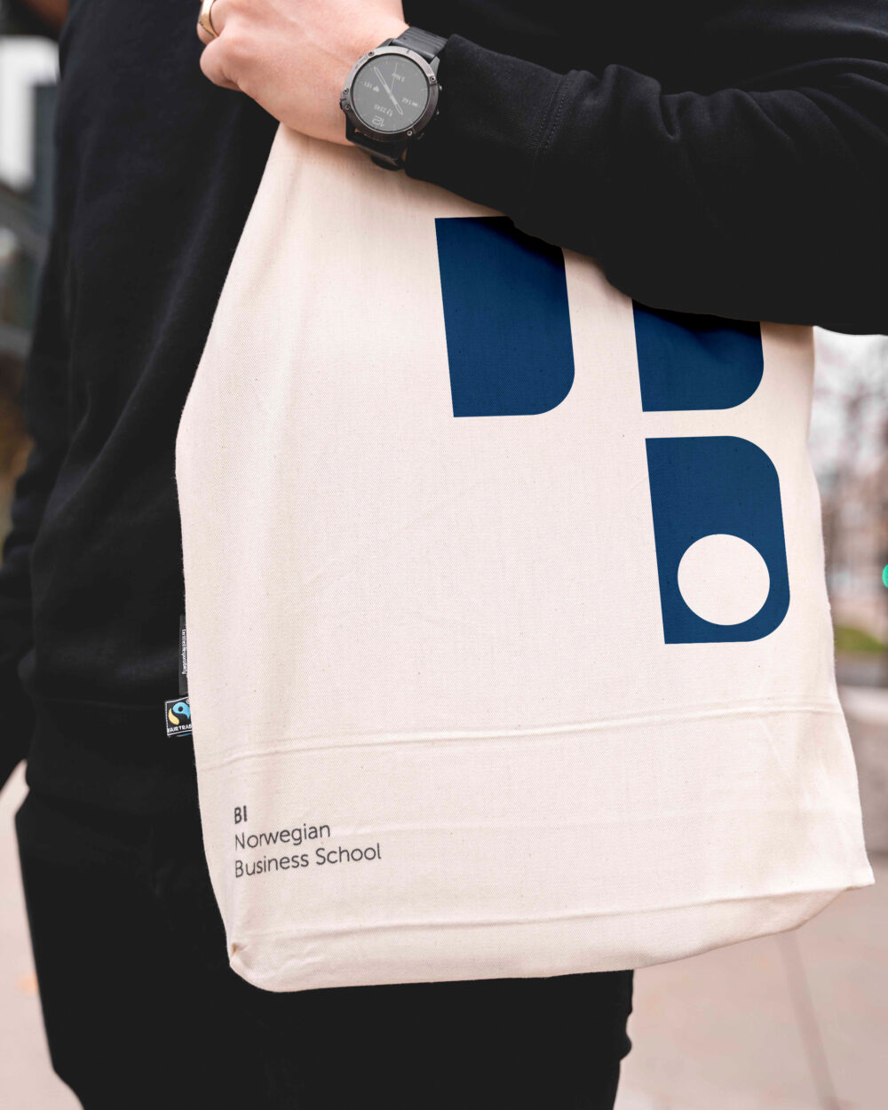
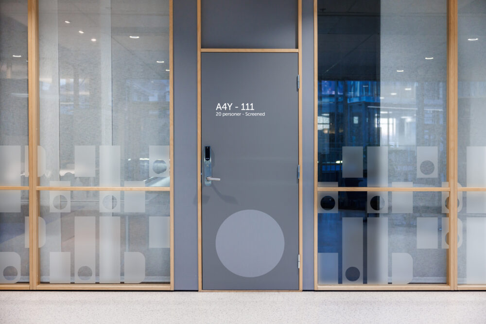
Examples of elements in context
