Typography
Last updated 26. June 2024
Museo Slab
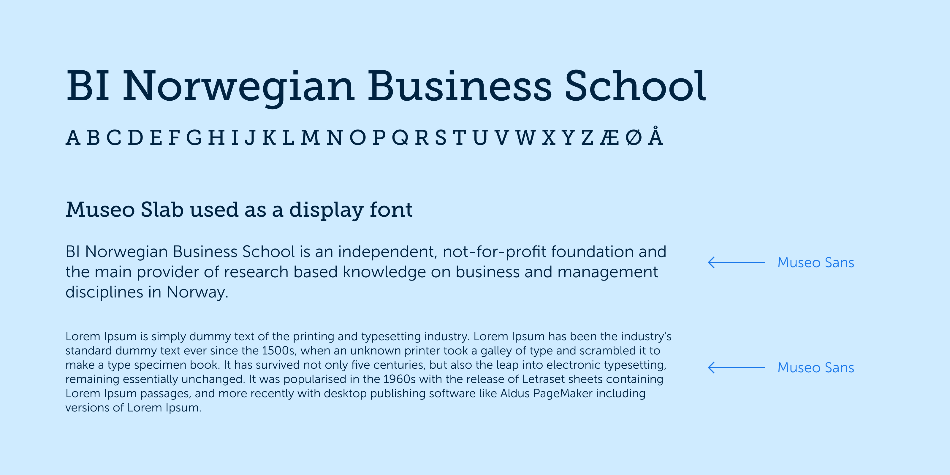
Museo Slab is used at the font weight of 500 as a display font for headings.
It is used in combination with Museo Sans.
Museo Sans
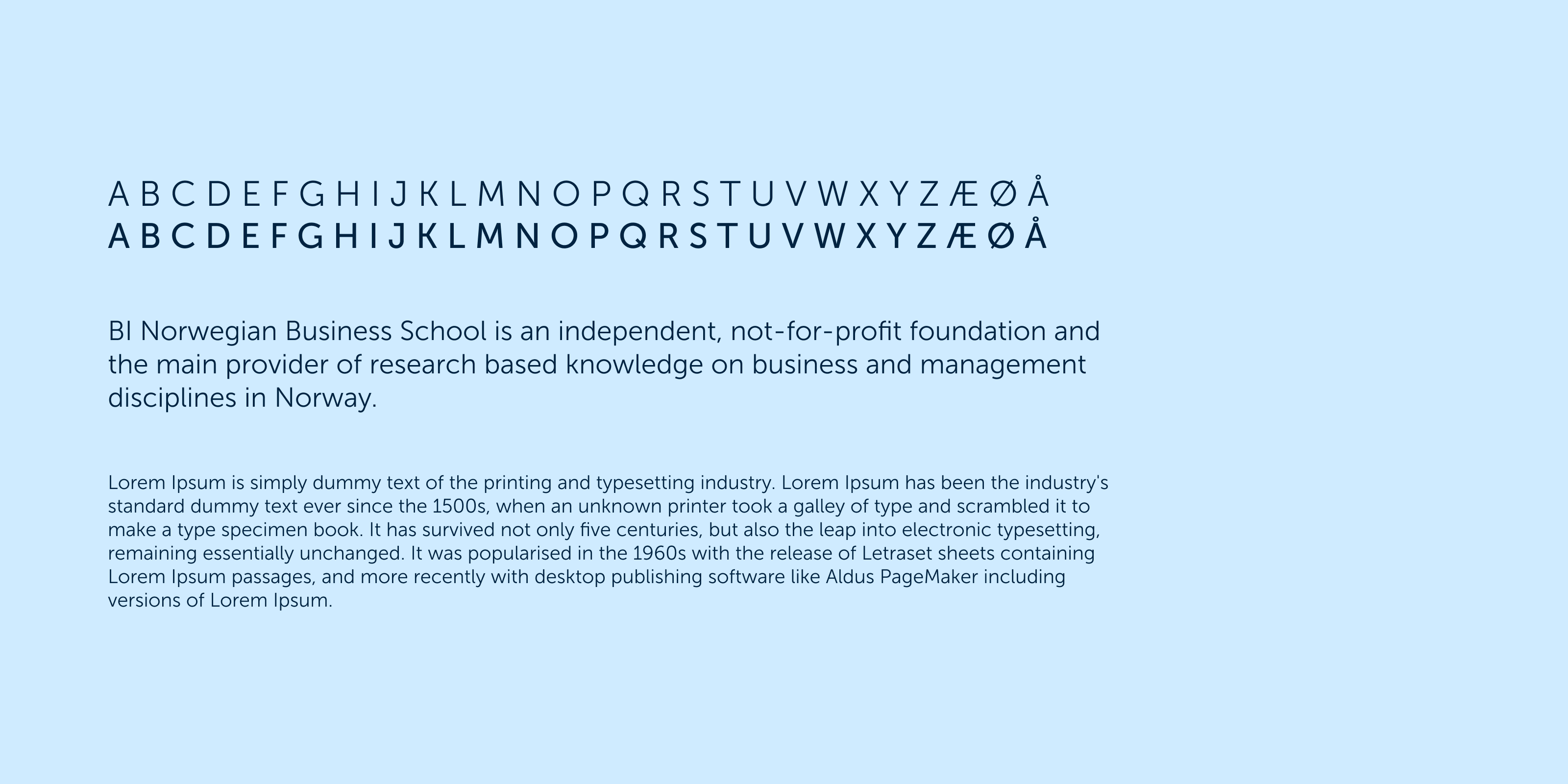
Our primary font is Museo Sans. The font has clear and defined outlines that make it easily readable, particularly in smaller sizes on digital platforms.
The round original form creates a dynamic expression without losing authority.
The font weights in use are 300 and 500.
Fallback typography (Arial)
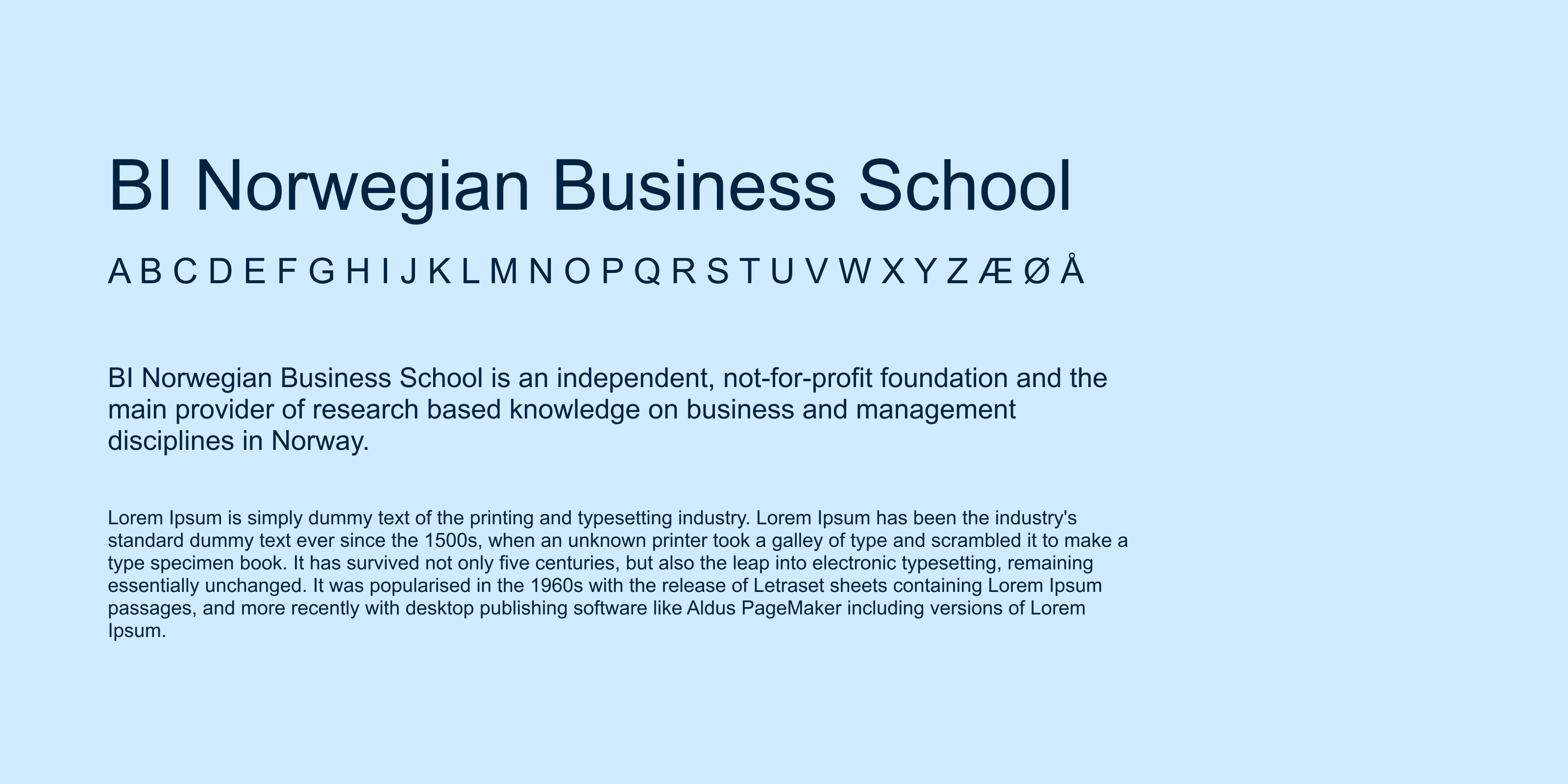
As Museo Sans is a licensed font, a system font should be used for elements that are not for official publication. A system font is a font that is included on all machines, meaning that anyone can use it. They are typically used in Word documents and PowerPoint presentations.
Arial will be used as a replacement font for Museo Sans, as it shares many of the same characteristics.