Guidelines
Last updated 24. June 2024
Here are some inspiration and examples on how to make graphics with BIs profile.
Logo guidelines
Keep in mind what kind of background colour you use. It is important to have good contrast to make sure the logo is visible and clear.


Use the darkest blue as background colour when using the negative logo.


It is important to remember that the BI logo is a logo with transparent background and not a logo with fixed background. Meaning that the logo should be directly placed on the background. Please do not do as illustrated in the examples below.


Typography guidelines
Drop shadow and uppercased text hurts the readability. Avoid when possible

Uppercased text
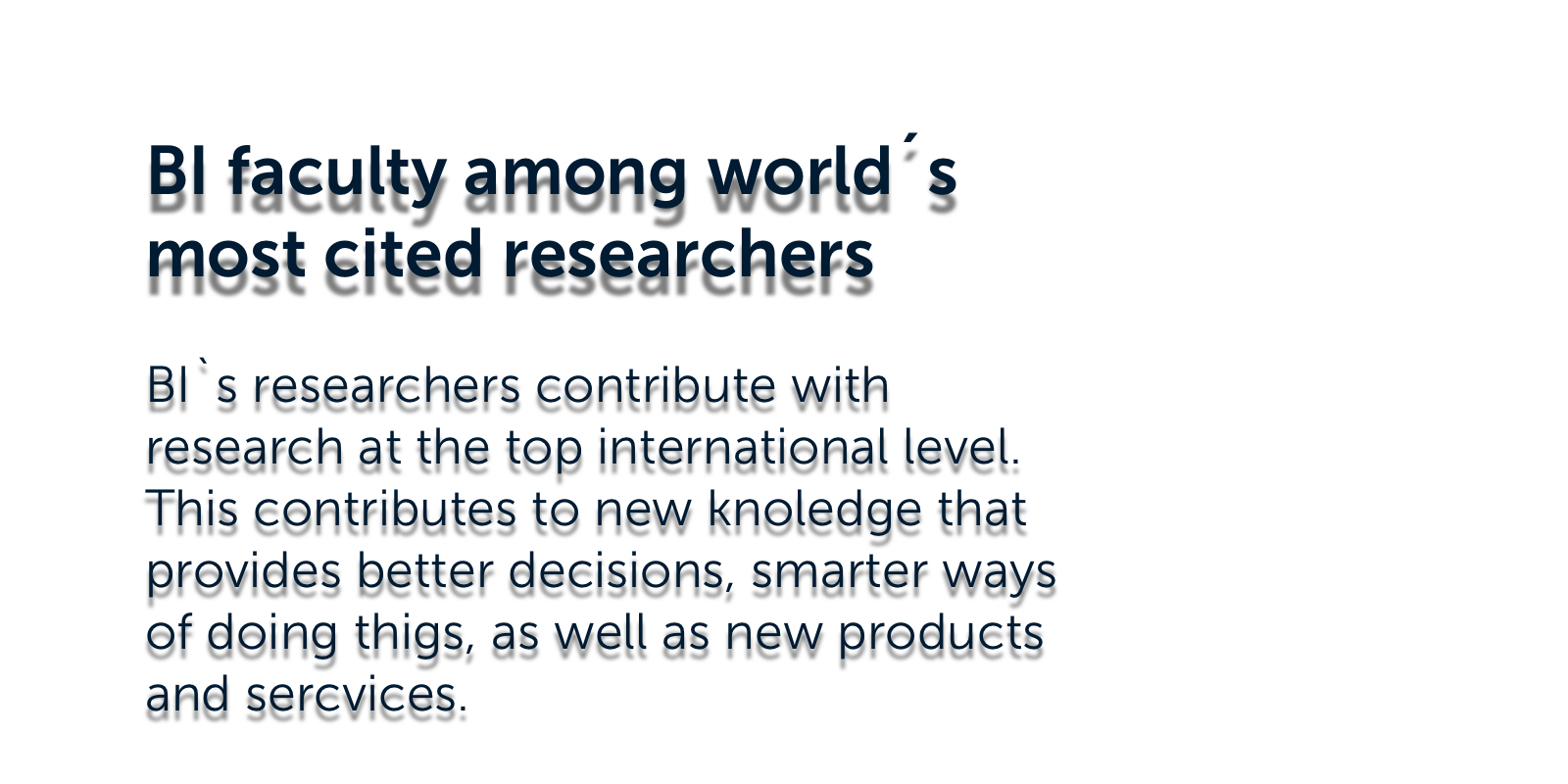
Drop shadow on the text.
Colour guidelines
Consider the contrast ratio. Examples below show how to use colour combinations correctly.
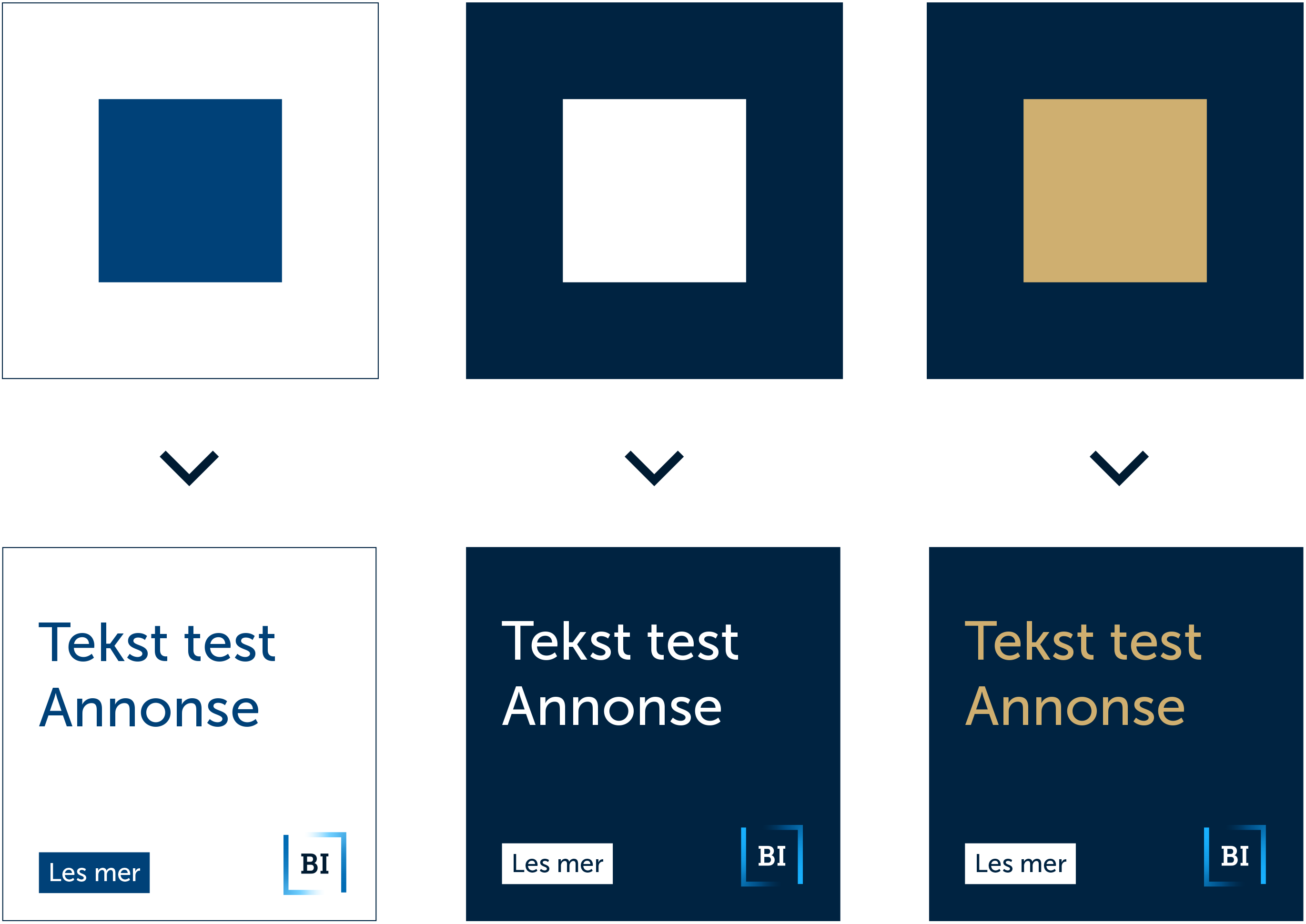
Examples of how not to use colour combinations. There is too little contrast between background and foreground.